Link #1: http://jvavrah We are able to th.wordpress.com/
I really liked the layout of this blog. The size of the pictures is a perfect size for viewing. It's not too small, and it's not too big (for people with smaller monitors). It would be cool if our digital portfolio website had this feature on each category of the portfolio. For example, if somebody had a portfolio with the categories art, music, and language arts, each page of the portfolio could have a blog like this one. Viewers of the portfolio could be directed to a home page that included all three categories, and when they click the hyperlinks on the home page, they could be directed to a blog so they could easily navigate the poster's work by date posted.
Link #2: http://alexiscoronasdp.weebly.com/
I thought the home page was really cool on this site. It's very welcoming and makes me want to explore the website further. I would like to use the idea of using square tiles with photographs on them, but change it a little bit. Instead of having square tiles on the home page that are irrelevant to the rest of the site, we could have photographs with text on them that link to pages of the site. So to go back to our example, we would have ten photographs on the homepage. Three of the ten photographs would have text on them which would be art, music, and language arts. Each of the three tiles would link to another page of the site.
Link #3: https://sites.google.com/a/hightechhigh.org/aclay-s-d-p/9th-grade/humanities
My favorite part of this website is the left sidebar that contains links to each page of the portfolio. I like this component of the website because it makes navigating each individual page of the portfolio incredibly easy. It makes it possible to find any page of the portfolio from ninth grade to twelfth grade all on the same page. The sidebar is in the same location on every page of the site, and you don't need to hover over any text to get to where you need to go.
Overview
If the blog page of the first, the picture tiles and good design of the second, and the sidebar of the third were combined, our website would be very a very visually appealing and easy to navigate, things which each of the sites lack on their own.
Monday, January 21, 2013
Saturday, January 19, 2013


2013 Building A Digital Portfolio Site

We will be designing and building out a project for a client who needs a website that supports "Digital Portfolios". Please review the links below to see some examples and post some feedback on at least 3 of the links and the components of those portfolios that work well for you:
home page samples:
http://www.hightechhigh.org/schools/HTH/
http://www.hightechhigh.org/schools/HTHCV/
staff/clubs portfolios:
http://www.chrisrosskopf.com/
https://sites.google.com/a/hightechhigh.org/mr-aguirre-s-dp/
http://jvavrahth.wordpress.com/
http://ww2.thegnproject.com/
student portfolios:
https://sites.google.com/a/hightechhigh.org/aclay-s-d-p/
http://alexiscoronasdp.weebly.com/
http://dp.hightechhigh.org/~ccate/
http://dp.hightechhigh.org/~pyurick/
Blog Site:
http://blogs.hightechhigh.org/aterronez/pedagogy/
Wednesday, January 16, 2013
2013 Garret Nelson: Reflection of Sites #2
2013 Garret Nelson: Reflection of Sites #2
Website #2 MobileiPhoneGuy

I thought this site was very well done. First of all I really like how the image
keeps changing in the background. I also
really love the layout of this page. The
MobileiPhoneGuy’s logo is in a good and noticeable spot. I also like how the social networking bar
does not take up a huge amount of room.
I also like how they put their own color scheme on the social networking
bar. I really like the color scheme
(green, white and black). There is a lot
of good content on this site. I really
like how they added and about section. I
feel these are good for insight on the companies. They make the customer know that the company
is real and not a fake. I do think the
Services section could use some work though.
There are two solutions that come to mind when I look at it. The first is to create more of a chart and
the other is to color the heading green.
I thought the gallery was done well.
For some of the sections I feel that a dark grey template would be good
(without getting rid of the black background).
I also think the FAQ was a great addition it answers the basic questions
like their business hours and their methods of payment. I think my favorite part about this site is
the contact section. It really seems to
be a convenient way of getting in contact with the company. One thing I think the site could use is a
blog. I feel blogs make people feel like
they know the companies activities and who they are. Overall, I think this was a pretty good site.
2013 Garret Nelson: Reflection of Sites # 1
2013 Garret Nelson: Reflection of Sites # 1
Website #1 Digital Media Management

First of all I would like to say that the black, white and red blend very well and are appealing to the eye. This seems to be a very successful color scheme in other works. I also really love the background. The pattern in the background (which resembles scratches) reminds me of stainless steel. It is a very clean and metallic look; I think it goes great with the rest of it. As far as getting their message across I think they did a great job. The info was very brief and easy to read; which I feel a lot of people like. Also I found it very interesting and effective how the main points are in red font color. So in the end I got the message they were trying to get across; so I feel it fulfilled its purpose. As far as the social networking goes, I think they did a great job. I think the Facebook, twitter, instagram and YouTube links are placed in a good spot. I also like how they added Instagram; I’m not sure if it’s just me, but I feel some sites leave out Instagram. I think this is a big mistake because I feel Instagram’s user number is constantly increasing. I also like how they added a Skype phone number. I feel this is a very effective way of communication. I feel the main page was a little crowded though. I think they could have moved the DIGITAL MEDIA MANAGEMENT logo along with the website navigation bar up. This would cover up the blank spot in the upper right corner. I also felt that with the navigation bar and logo in the top right, they could elongate the test horizontally. I think that the blog was a great addition. I think blogs are very important, since they let you know about the company. When I looked at their blog I got the idea that they were professional. I think their use of celebrity endorsement and the Emmy Awards was very effective too. The layout of the blog was a good. I do think they should have left less room on the sides though. I feel the main page was a little crowded though. Overall, I think the page was good.
Sunday, January 13, 2013
2013 www.alexa.com: All About Metrics

This week we will be exploring how website traffic statistics can be analyzed. Check the link below and give a brief reflection on what Alexa.com offers: http://www.alexa.com/siteinfo/youtube.com
Good Luck with your reflection,
S
Friday, January 4, 2013
2013 Stewart Vandlen: Reflection of Sites
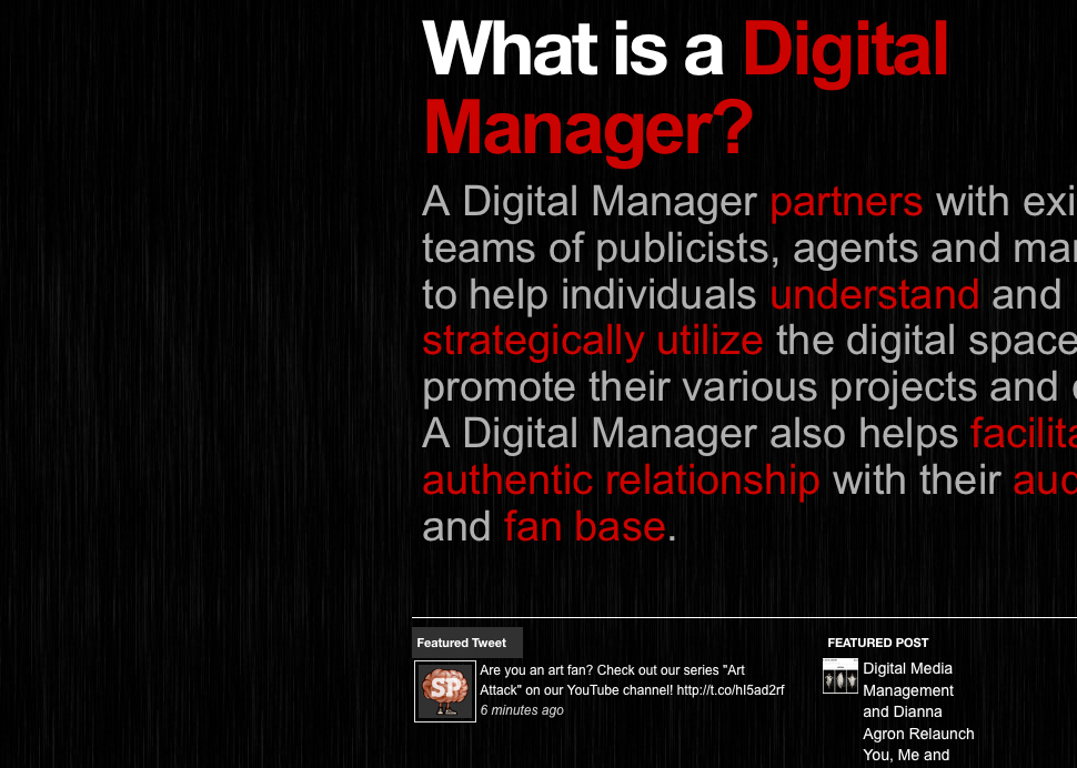
Website #1: Digital Media Management
I really like the use of color on the home page. The use of red on keywords looks very professional and doesn't feel forced or out of place. The use of the colors red and black also meshes nicely with the logo and background on the home page. I think this page would look a lot nicer if the word 'manger' were moved from under 'What is a' to the right of the word 'digital' because the black space in the upper right hand corner makes the page feel cluttered and messy, diminishing the aesthetic appeal of the web page. Another way to combat this black space in the upper right hand corner of the web page is to move the logo up an inch or two. If the logo were moved up, it would still look good to have the word 'manager' under 'What is a'. I also see another potential problem in the 'FEATURED POST' section at the bottom of the home page. The text of the current featured post is crammed into a very small vertical space, while there is quite a lot of unused space in the bottom right hand corner of the page. The page would be much more appealing if the text stretched further horizontally to fill the blank space. On the 'ABOUT US' page the bios are long walls of text while there seems to be plenty of room to the left of Luigi's bio. The page would flow better if the text ran further horizontally. Also, the font size is kind of small, and thus potentially hard to read for some views of the website. I really like the way the 'OUR PARTNERS' page is laid out with the icons of each person and website as a small square with social networking links to the right of each icon. One thing that would make the page more appealing would be spacing out the icons in the 'THEATRICAL' section from 4 icons on 3 lines, to 6 icons on 2 lines. The black space to the right of the icons is a little distracting.

Website #2: MobileiPhoneGuy
I really like the background at the top of this website. It is very bold and unique, yet subtle and professional at the same time. Another thing I really liked about the website is the social networking icons. The color and design of the icons works very nicely with the color scheme and layout of the page. The great thing about the placement of the social networking icons is that they are placed in a ideal location: right at the top of the page. The social networking icons, while very bold and impossible to miss, are very discreet and subtle. One of the things that I didn't like about the website is that every aspect of the website (about, services, gallery, FAQ, and contact) is on the same page. Having every part of the website on the same page makes everything seem squished together and cluttered. If each piece of the site was located on it's own page, it would give each piece of the site optimal space to serve its purpose and more comfortable to use. I really like the way the gallery section is laid out. It occupies the perfect amount of space, without thumbnail crammed together or too distant from each other. I also really liked the Instagram integration in the gallery. Looking through the Instagram photos taken by the company made the website feel more personal and friendly, which gives me the impression that the company has the interests of its customers in mind. If I could do anything to make the FAQ better I would make it longer and give each question and answer more space. When the website is laid out as it is, each answer is a long wall of text, and kind of hard to read. I really liked the contact section. It is very clean and user friendly. The green text boxes look very clean and polished. I also really like how the calendar pops up when you click on 'DESIRED APPOINTMENT DATE/TIME'.
Thursday, January 3, 2013
Subscribe to:
Posts (Atom)